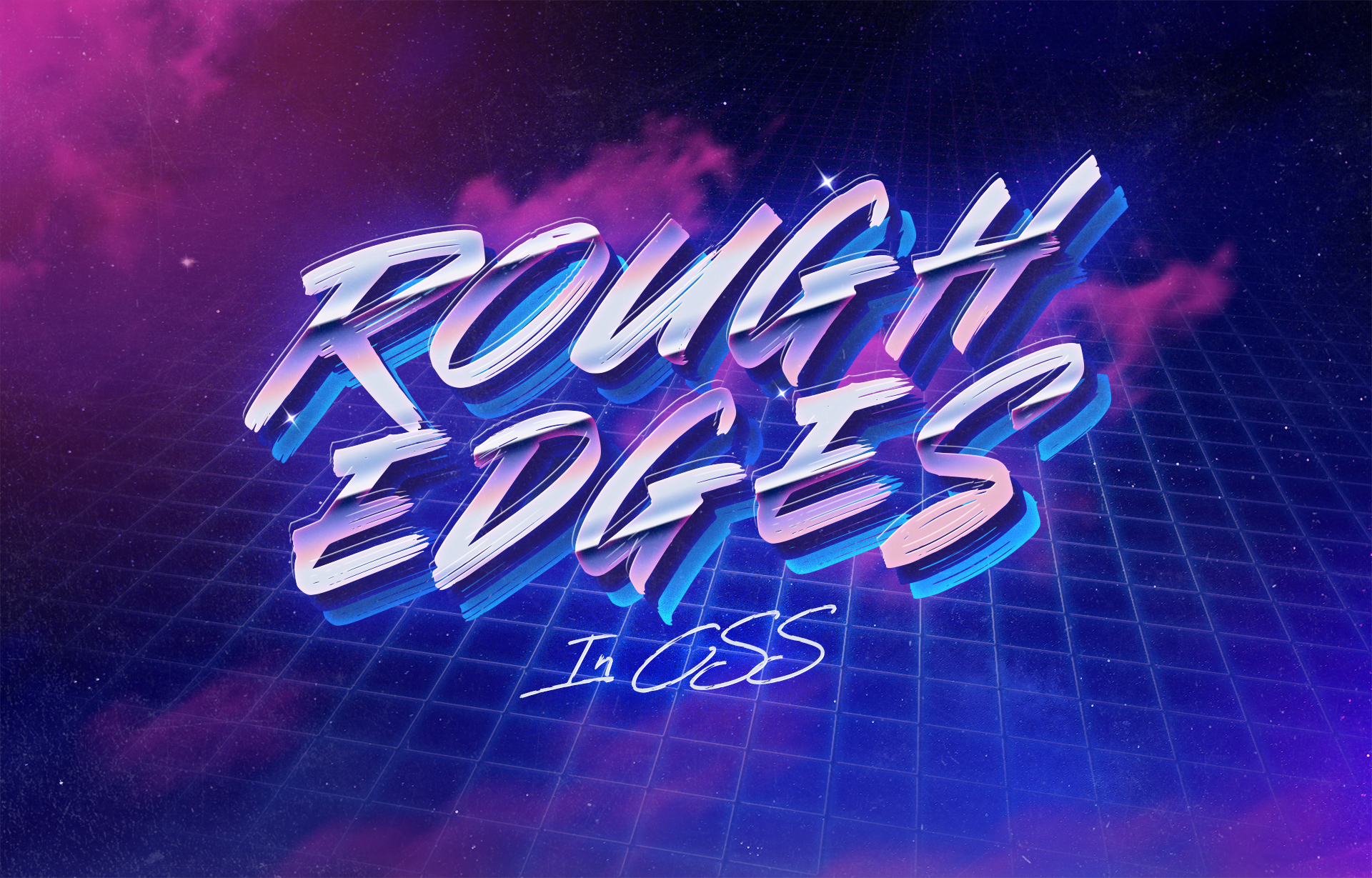
How to make rough edges with CSS and SVGs
While finishing up this website I was browsing around for some inspiration and checked out Jack McDade's excellent new Statamic starter kit "Starters Creek", something immediately jumped out at me, he had added rough edges to the images on the blog, pictured below, left without rough edges, right with:
.png)
I had been trying to work out how to achieve this effect for the best part of a couple weeks, but kept coming up short on google, my thinking was that I would have to use an SVG image to create some form of clipping mask, this issue was that that wouldn't of been very re-usable as it would have been a fixed svg with specific dimentions.
I set about diving through the source to work out how to achieve this subtle but rad effect, as it's turns out Jack had used a super simple approach which consisted of added an SVG filter to the image:
.squiggle {
    filter: url(#squiggle);
}
This filter references an SVG which included just below the closing body element like so:
<svg
    xmlns="http://www.w3.org/2000/svg"
    version="1.1"
    height="0"
    width="0"
>
    <defs>
        <filter id="squiggle">
            <feTurbulence
                type="fractalNoise"
                id="turbulence"
                baseFrequency=".05"
                numOctaves="4"
            />
            <feDisplacementMap
                id="displacement"
                in="SourceGraphic"
                scale="4"
            />
        </filter>
    </defs>
</svg>
The genius here is that the filter works dynamically on whatever element it is applied to. I have created a codepen below which shows what each of the filters looks like, and the combined output of the two:
See the Pen SVG Filters by Daniel Jones (@dannydjones) on CodePen.
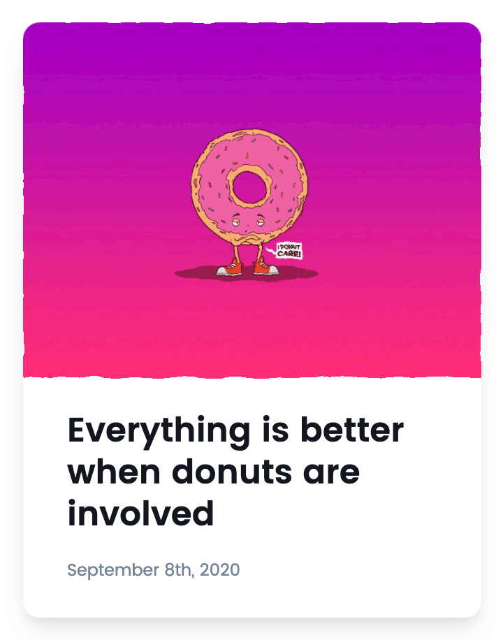
I have used this effect across my website, with my favourite spot being on the article card hover effect, where I feel it adds a bit more personality:
.png)
.png)
I hope this quick tip helped!